


Living Encyclopedia: Research Mode
To unpack what Dataland’s Living Encyclopedia means to me, I pull back the curtain on the different modes. This month is Research Mode.

Last month, I covered Dream Mode1 in Dataland’s first experience: an Artificial Intelligence (AI) system trained on nature data conserved by some of the leading institutions in the world and comprising over 180 million datapoints. This month, I want to cover the other end of the cerebral experience spectrum: Research Mode in Dataland’s Living Encyclopedia. While we use our minds to both dream and research, they occupy different ways of thinking. Dreams are present and ephemeral thoughts. Research is a methodical process to organize thoughts. In this post, I will share different ways we present the same data to users in the hopes to solicit these modes of being: Dream and Research.
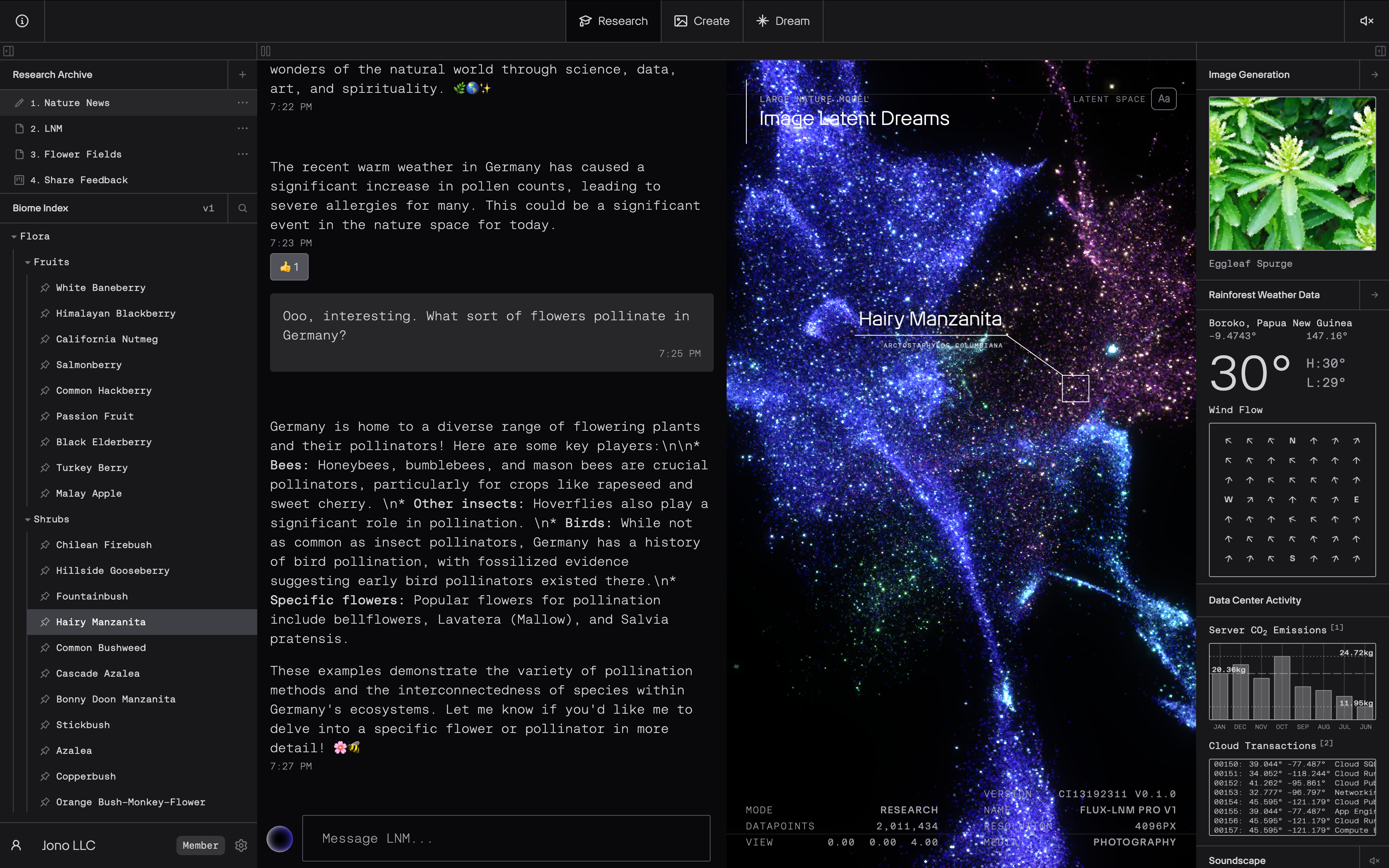
In Dream Mode, we focus on a visualization of the AI’s mind (seen in the above picture as the celestial body on the right side). It is a way to spatially organize the data Refik Anadol Studio’s fed to the AI model. The user interface is reduced to a top bar to switch modes. While you can click, tap, or drag to pan around the space yourself, you do not have to. The application wanders through the AI’s mind highlighting points of interest and revealing different species of flora, fauna, and fungi. Refik has described it as “meditative”. Research Mode (seen above in its entirety), on the other hand, confines this visualization to a box. The mode populates many other user interface elements around it for you to explore. It is rigid in its design and generous in its presentation of information. Unlike current AI products out there, the Living Encyclopedia embraces two cultural ways of engaging with and consuming information: European design associated with minimalism and Asian design associated with high-density layouts.2 As much as I enjoy and sometimes identify with Japanese culture, I am not Japanese. So, while we took a high-density approach to laying out Research Mode, I relied on western ways of thinking to connect the boxes together.
The approach I took, is reminiscent of my 2021 piece Curaturae: Writing with Open Access. Every element in Research Mode has at least one interaction or reaction to another one. For example, if you click on a biome from the “Biome Index” on the left-sidebar it will populate into Large Language Model (LLM) chat box to the right of it. It also prompts the “Image Generation” to draw an image based on the biome’s scientific name. This kind of high-density layout with a tight web of correlated interactions has two academic references: Edward Tufte’s Supergraphic3 and Oulipian rules4. The result, I hope, is a kind of choose your own adventure through the data. If the chatting to the LLM resonates with you, then you can do that. If clicking on the weather data captured by Refik’s studio or server communications piques your interest. You can do that too. There is no right way. AI models are highly complex multi-dimensional systems. By bringing disparate aspects of the means of production to the user, our aim is add meaningful pathways through this complex system. So you can assess it for yourself.
Through different modes you have different ways to sift through the massive amounts of data compiled by Refik Anadol Studios. And through referencing different cultural ways of consuming information, we present a truly different take on AI systems. One made by artists, that I hope you will try. And starting today, the Living Encyclopedia is available to anyone. It costs $10 / month or $100 for a year of access. If you sign up for a monthly subscription you receive a 14 day trial. As a small gift to my readers, you can checkout with the promo code JONOFYI and receive the first month free (limited to the first 100 orders). To get started, click the red button above.
If you give it a try, please tell me what you think! This has been years in the making. These behind-the-scenes posts aim to convince you that this type of digital experience is not only unique to Refik’s artistic vision, but to mine as well.
–Jono

Japanese web design: weird, but it works. Here’s why. Phoebe Yu. 2024.
The term Supergraphic is explained in The Visual Display of Quantitative Information. Edward R. Tufte. 1983. https://www.edwardtufte.com/book/the-visual-display-of-quantitative-information/.
Explanation of Oulipian rules within application user experience in Curaturae FAQ: Why does the application only select nouns and verbs? https://curaturae.com/faq#why-does-the-application-only-select-nouns-and-verbs.